Wednesday, September 7, 2022

Toilet etiquette cat AI paintover


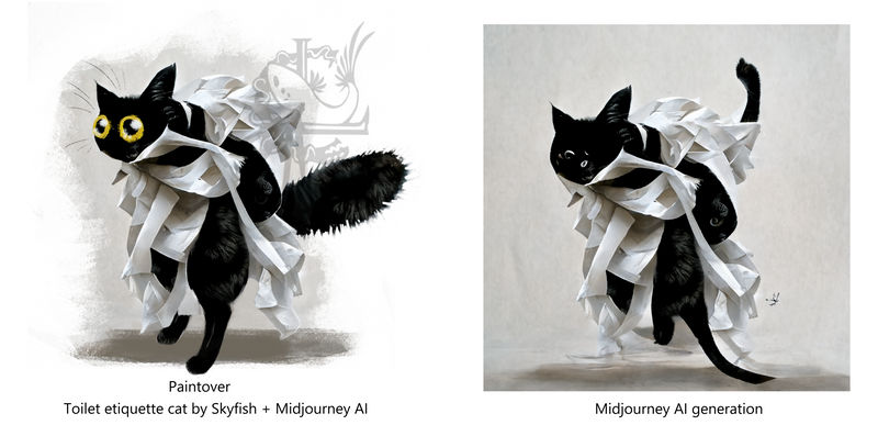
digital painting of a cat wrapped in toilet paper, collaboration between human and AI

I have been experimenting with AI image generation lately. The image on the left is my interpretation and paintover of the AI generated image on the right.

The task at hand was to illustrate some rules for a toilet at work.
I wanted it to look a bit funny so I searched up in the public gallery of Midjourney (I have a subscription) to look for "Cat toilet" hoping to find some suitable generation of a cat using a cat litter tray  that I could simply slap on the rules. But I got a bit overboard.

Instead I found this cat wrapped in toilet paper. I loved that idea much more than I had envisioned and found it hilarious, so I had to paint what I saw in it. If you have acsess to midjourney you can find the link to the generation here: www.midjourney.com/app/jobs/f7… It was created by user "bunnyduster" with the prompt: "realistic black and white cat dancing with ribbons of toilet paper falling around him"

Friday, March 4, 2016

CNC milling: Stamp part 4


The day has finally come where I finished my stamp/seal project. Almost a year ago I decided to learn 3D modelling and start making it. Now it is complete.


(although I will add a handle later) 
I had put this project on wait until we got a laser cutter, but in the end the CNC mill is probably the better choice. 
In order to fit my logo design into such a small scale, I decided through some trial and error to make a second version of the logo. It is a symbol form of the original. I made 4 attempts to recreate it using different methods. In the end I settled on making the design with open paths (illustrator) because this assured me that no area would ever be thinner than how wide the drillbit might be.


First I drew the shape as a sketch, real size 2 cm wide. Above is an automated vector shape created with Adobe Capture. It makes messy paths. I tried tracing it, but was unhappy with the shapes I created. There is some appeal to the blotchy looking result above, but not for this purpose, where I wanted a clean look.


Above is the final version using set width open toolpaths. It wasn't what I had thought of first, but I quickly became fond of the symbol.


With the help of Nordvik we milled the seal in aluminium. I believe that the part being in metal helps disperse the heat from the wax fast, making it much more functional than other materials.


The part is 35 mm wide. The path is 2mm


Final results, testing with ordinary candle wax.


Here is a bonus picture of Yoshi at work taking pictures of the milling machine working. We milled at Bitraf.

Recursive photoception

Saturday, February 27, 2016

Dragon egg project (wip)

WIP Project: Dragon eggs

(Note: W.I.P stands for Work In Progress. Posts tagged with WIP can be voted on here in order to encourage me to re-prioritize what to work on)

The Dragon egg project consists of trying to make a mould for wax casting cool fantasy candles. The first idea I had is of a simple candle wax egg, hence the name. 

First attempts at a dragon egg model.

First attempt at a mould
.
Mould with tabs to ease opening, holes to line up the pattern, and notch to see how the parts are oriented.

I expect the first version to have a few problems, mainly the pattern might be too detailed, and when trying to remove the candle from the mould I expect it to be stuck, I may have to print the model itself and do a latex cast of it instead of 3D print it directly. I want to 3D print and test it to be sure however, I won't know if it has failed before it has failed after all. Another problem is that it has overhangs and can't be printed in the orientation I wanted.

The next version I am working on will have arched legs stuck to a larger surface of the egg body, for strength and avoiding overhangs when 3D printing.


Monday, February 1, 2016

Post Game Jam Update

Progress update on Global Game Jam Oslo


GGJ went off to great start for us at Oslo, we all gathered in the auditorium, where two talks were presented by Sam Partridge of Failbetter Games and Tom Kail of Inkle Studios. Of course the keynote was also shown.

New this year: we were all split into random practice teams in order to encourage people to form teams with strangers. The teams had a few minutes to come up with a game idea on the spot and then present it. I ended up on team 5. Thanks to this, something funny happened:

During the "find your teams" chaos, we all held up our hands with 5 fingers, resulting in us greeting each other with high fives. This then spawned the idea that we could make a a high five game. It then evolved into a body language and symbol game. We were a bit unclear on the rules, but it goes something like this:

A gesture based game

2 people stand back to back. One person is Leader, and the other is Follower. The leader makes a gesture with their arms. A third person, the interpreter, looks at the gesture and tries to communicate it in 2 words. The Follower then has to mimic the gesture based on those 2 words. If the Follower manages, they win a point and become leader. The next person in the queue then takes a spot as the new Leader. If the Follower doesn't manage, the follower goes to the back of the queue and the next person tries to be Follower.


Forming the new teams

After the team excercise, we were free to form teams any way we liked. I and Tzer0 had agreed to work together, but we had no concrete plans and ended up teaming up with the two speakers who stayed back in the auditorium. As time progressed throughout the event, more and more people migrated to our team, to a total of 7 members! That is the biggest team I have been on in a game jam.

Team composition:
Programming: Samuel Partridge (@SamuelPartridge), Tom Kail (@tomkail), Jan Anders Bremer (http://underhound.eu/), Eivind Hyldmo
Art: Christina Lewis (@SkyfishArt), Martin Joakim Ulstein (@Howlstone), Jonas Nordby,


The new game


Theme: Ritual
The game idea we attempted also came from the practice team session. It is based around a time loop where some cultists are trying to perform a ritual, and other characters are trying to stop it. Since there is a time loop, the player controls all of the character, one turn at the time. (or you can play multi player) The first round there is only one character on screen, the next round there will be two, but you only control the recent arrival. Different goals will be displayed on the screen, so if you play as the knight, you might want to kill a cultist. Or if you are the sheep, you may want to run away.
I don't know much about the coding but it sure looked like the programmers were busy, and we didn't quite finish it. It was playable before the deadline however, so I consider it a success.
Additionally, Tzer0 (Jan) made a fully functional audio system involving fading in and out of synchronized tracks, that would turn in and out from the menu, making  sure the audio was never interrupted. 
That means my goal of having "a game that does not sound annoying to someone not playing it" was halfway met. (the sound effects were still haphazard and the baby literally explodes)

Personally, I contributed to the art. I wanted the game to be set in space but I was overruled, so a lot of my work was made redundant. I wish I had understood sooner. Still, the tiling floor, altar slab, and background were made by me, as well as the blue cuthulu alien character. I had issues taking screencaps near the deadline so they are brutally blurry. I used "Sword & Sworcery" (game) as a style guide for the other artists to make the characters with.

Things I learned:

  • Use images with pixel ratio dividable by 4 because something something programming something unity.
  • How to pull, commit, and push art into game with git, using sourcetree. Will git again.
  • How to open project in Unity. There is a first for everything.
  • When something is bothering you, just say it. There is no time to be annoyed and the consequences are probably tinier than you think.
  • Don't assume you understand what anyone meant. You never understand what anyone meant.

Thursday, January 28, 2016

Global Game Jam Oslo


Global Game Jam is this weekend. 29.-31.January

Global Game Jam Oslo is being held at Westerdals.

I'm participating with my programmer buddy Tzer0 but we might have to look for more team members. We are gearing up for a potentially 3D VR experimental project this time, though I'm woefully under prepared with my mixed noob 3D abilities. I'd place my bets on a simpler game for the jam and the VR for later. See you there?

Wednesday, January 20, 2016

Dream Bestiary project (wip)

WIP Project: Dream Bestiary

(Note: W.I.P stands for Work In Progress. Posts tagged with WIP can be voted on here in order to encourage me to re-prioritize what to work on)

Dreams are a core interest of mine that I never tire from talking about. I document, study, and draw inspiration from my own subconscious dreams. In order to do something concrete and perhaps commercially viable with the subject matter, I'm thinking about embarking upon a quest of documenting all hopefully most of the strange creatures that form in them. This project is in it's early idea phase, with some sketches and paintings having started. If I were to make a book, I'd either select a simpler art style and redraw the creatures clearly to communicate their designs more easily, or perhaps just select art styles that suit the individual creatures. The original sketches seem too raw and messy to make sense to anyone but me, I fear. I'd like to self publish the results eventually, if I do take this path.

Older examples of unprocessed dream sketches below.
To see dream sketches as I upload them, or to see my dream folder follow me on Deviantart. (That is where all my art images are hosted)

dream sketch: masked characters

Dream sketch: infant bird mole with chains?

Friday, January 15, 2016

Trying fusion 360

Thought I had enough having attempted to learn 3ds max, blender and mudbox? WELL YOU THOUGHT WRONG!

My new crush is currently Fusion 360.

Fusion 360 looks very enticing.
I haven't abandoned blender of course, I'm sure they have pro's and cons. Fusion is more of a full scale product design creation tool. But I won't find out for real until I have tried them both sufficiently. I am hesitant to learning new programs before I even know the others, but the user interface was just too smooth and the built in tutorials are super alluring.
Neither Adobe programs and 3DSMAX can compare to such a intuitive UI and pleasant look. Besides, fusion is free for small business and students.
Unfortunately I'm getting bugs trying to import my vectors so I have no idea where I will go with this until I find a work around.

Wednesday, January 13, 2016

Work In Progress - Decide what I do next

Want to affect what I do? Now is your chance!

WIP stands for Work In Progress.
I have got many ideas I would like to work on in the nebulous "some day" time. Most of my projects start off enthusiastically before I forget them in a corner somewhere. In order to complete more projects I have now decided to keep a little directory here with projects that have gone on ice. If you want to see me work on that project, all you have to do is comment about it, this will be sufficient external motivation to rejuvenate my enthusiasm and re prioritize (within reason).

This post will be updated to list blog entries tagged with WIP as I document and upload them.


WIP: Aquarium sculpture

WIP: Fantasy wax candles


WIP: Ridiculous Dreamcatchers 


WIP: Dragon Bestiary

WIP: Masks


WIP: Dream Fakemon Bestiary

WIP: VR experimental interactive gallery

Wednesday, January 6, 2016

Commission: Dragon Chomping Moon Cheese

First artwork of the year!

It's based on a funny photo of the commissioners pet rat and his dragon character (who is based on a ferret).


Reference:

Want to commission me? Send me an email.

Friday, October 16, 2015

Ludum dare 33 post summary

It's that time again, Ludum dare 33, our favourite game jam, had been and gone.

The resulting game can be seen here: Pokemen - Ludum Dare 33

indie game about pokemen. From ancient cornish, meaning: stupid, clumsy.
Indie game about Pokemen. From ancient Cornish, meaning: Stupid, clumsy.
The theme: "You are the monster". I took the familiar concept of Pokemon, everyone's favourite monster battling game, and replaced the monsters with "pokemen" instead. In my design, you control the monster directly, becoming a literal interpretation of the theme at first. However, as the battle progresses, you can see your trainer off to the side shouting commands and encouragement. After a while the trainers dialogue will become progressively more abusive. The worse you do the more abusive the trainer becomes. The pokemen battle to the death and we attempted to implement some gore. This way, it is actually the pokemen trainer who is the true monster, for abusing their slave pokemen. 


3 different pokemen to choose from
Charlog, Bulbabud and Squirtop.

The game plays a bit like a 2D fighter. tzer0 did all the programming and sound and definitely worked the hardest of us two. Next time I'd like to find one or two more people since the time really doesn't stretch that well in such a small game jam.

Ratings

#338Audio(Jam)3.23
#587Graphics(Jam)3.27
#625Innovation(Jam)2.88
#628Theme(Jam)3.31
#671Humor(Jam)2.54
#791Overall(Jam)2.92
#791Fun(Jam)2.69
#823Mood(Jam)2.71
#1314Coolness47%

I was hoping to beat my Ludum Dare rating from my last game "Escape from Animal forest" but we somehow did worse on all scores. This I find somewhat disappointing since I tried much more to work hard this time around. It just goes to show that effort does not always equal output. Many of the small decisions and shortcuts I had to take left this game looking less interesting than the last one. I'll list some reasons I suspect we had a worse result here for my own reference next time:


  • fewer team members = a LOT more work per member
  • less time available = crappier result
  • Maybe avoid pixel art due to over-use in game jams. (hard to say if this was a cause or if my poor use pixels was, still, I love charlog)
  • more animation frames = less time on overall art
  • prioritise UI, menu and splash page better (didn't make these in time) These make up a lot of the game's "overall visuals" especially in screens that people judge us by.
  • Figure out what went wrong with colour palette before theme announces
  • make actual mock game before team announces to test for unforeseen consequences:
    -tzer0 didn't have "playable-game-in-browser"
    experience and lost a lot of time because of my unexpected demand for it.
    -Figure out what went wrong with colour palette before theme announces

    -Figure out how the art style will look in an actual browser (size of game border vs scale of objects etc)
  • add "fix user experience" as a responsibility on my timeslotting list to ensure the overall is ok.
    -many people had problems with getting the game to work including myself.

    Our commenters said the game wasn't "fun" yet this is the most complete game I have made in any gamejam, and it is the first where people complain about the lack of fun. I suspect that if you release an incomplete game, people get more lenient on the whole "no fun" but if you have a functioning game that is still not fun then it counts against you a lot more. I personally thought our "Escape the forest" attempt was very unfun and that pokemen was miles better, yet "Escape" had a much higher score. I suppose it is hard to tell with only two tries, perhaps simply better competition could explain the scores after all.


Below is my journal of this Ludum Dare proceeding for those interested:

I started early this time, one day ahead so I could test my setup. That was wise, as I had to update 7 programs (all adobe programs i use plus krita) plus one bug fix in krita. Besides I had to dust off my Krita - photoshop workflow. I rely on Krita for game making because of it's wrap around mode, mirror drawing, and generally the brush engine just feels easier to sketch with for some reason.

I drew my first pixelart in my testing. I MAY have been inspired to do so because I saw this cool artist just the day before: CELLUSIOUS his pixels are worth the watch. Pixels is really fun to work with because it frees me of my bad habit of getting lost in details.


Also played around with a screenshot of mario to see how it works and speculate about why it looks like it looks. I'm not fond of the style but I wanted to see what it could take to make Mario surreal. I like how I accidentally touched upon a potential answer to the theme that was chosen.


The theme this time around is "You are the monster"

Here is my 5 o'clock rambling list of ideas that I woke up to write (including spelling mistakes!):

Sheep or wolf u font know

  • Game mechanicallt
  • Morally
  • Hurt self to hurt others
  • Dentist,
  • Kids perspektive
  • Ea eat games
  • Hold your ground by waiting.
  • Bugs in software
  • Mario clone but play as koppa
  • Godzilla demolished.
  • Ant, wasp, wolf fight for survival
  • Anorexia, psychological monsters
  • Enemies controller, parasite swap body.
  • Pokemon re angled :
  • Bulbabud, birdy, rodentish, charmangler, char ming, squirtoob, s
  • Don't step over the line. He
  • Stepped over the line.
  • You are the dice in dnd campaign .

I think this theme is going to be fun, even if there will be a lot of obvious takes on "you are the monster" it will still be fun.


Once the game making actually began I rediscovered timeslotting. I had to complete 
  • creature design (pencil drawing)
  • creature render (pixel drawing)
  • level design (pixel drawing)
  • ui design
  • animation (magnificent 2 frames per action!)
  • moves (hopefully)
By dividing each task by the total time I had, I ended up with only about an hour or two for each task. ( I could not use the full LD time due to work)
Long story short, I had 7 minutes per frame of animation and I could only afford 2 frames per action (jump, attack, run etc). It may seem like a long time for just moving a few limbs, but I am not very experienced with animation OR pixel art so this felt like a very short time when I was actually doing it. Photoshop tricks like "transform" does not work with pixel art. pixels don't rotate (unless it's 90 degrees i guess). Some frames took less and some took more. 

All in all the project was as tiresome yet educational as gamejams always are for me and I will take my experience forward.