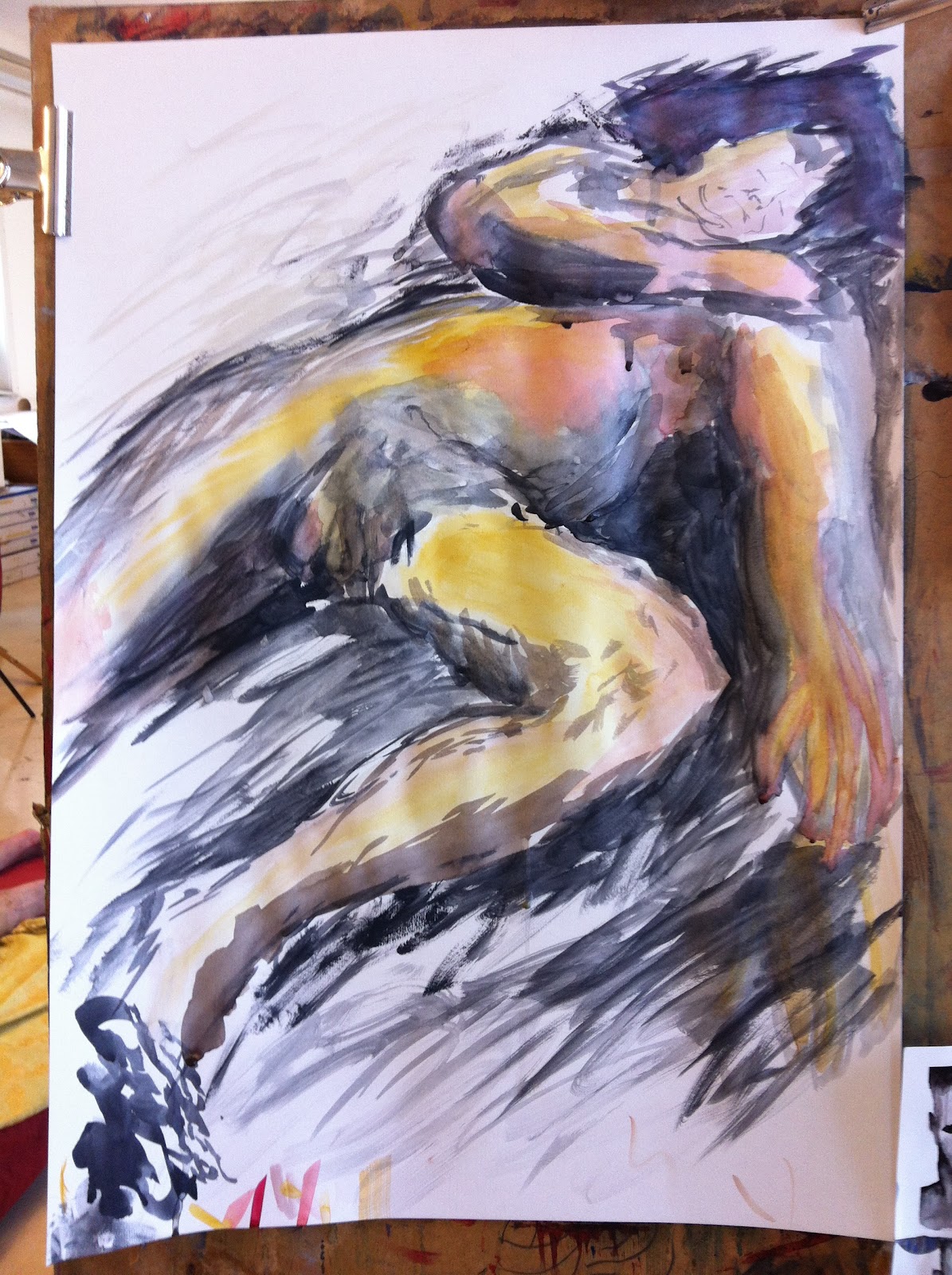
I'm still working on trying to find a unique way of drawing from life, I don't have any one style I favour over others yet, nor a favourite medium. I feel I made some progress with these though, so far in Life drawing, I have meant to do something similar to the reference I looked at, but every time I kept going back to classic-like rendering, overriding my previous decisions of whether or not I should use one colour for shadows and another for light, blend the colours, what colour is warm, what is not, and what colour to convert the model into on the paper. All those things I would decide upon and then ignore, resulting in messy, undescriptive images. This time I managed to stick with my decisions better though. Some of these are progress shots.
1

2.1
First time using these watercolours on a proper painting, I was unusued to how they interact. I liked the northern lights like effect in the background wash.
2.2
Trying to go darker with the colours, I quite liked the drip from the top with no pigment, would like to use that in the future.
3
4.1
4.2
I'm enjoying how the colours blend in this one, but it doesn't show too well on the digital picture.
5.1
Trying to be a bit more spontaneous and mimic the inkwork I did in my sketchbook in the last post, but I think it looks very different.
5.2
I was a bit late on this one and didn't get to go into detail before the model moved when I was working on the face.
6.1
Worked out the proportions before rushing in with colour, no idea what it would turn into.
6.2
Realized I was doing classical shading at this point trying to build up realistic colours, so I stopped that and did the next step instead.
6.3
Looks a bit like an exray now. I don't fell any particular way about that. I think this one might be my favourite out of the session.